12 ggplot extensions for snazzier R graphics - InfoWorld
ggplot2 is not only the R language's most popular data visualization package, it is also an ecosystem. Numerous add-on packages give ggplot added power to do everything from more easily changing axis labels to auto-generating statistical information to customizing . . . almost anything.
Here are a dozen great ggplot2 extensions you should know.
Create your own geoms: ggpackets
Once you've added multiple layers and tweaks to a ggplot graph, how can you save that work so it's easy to re-use? One way is to convert your code into a function. Another is to turn it into an RStudio code snippet. But the ggpackets package has a ggplot-friendlier way: Create your own custom geom! It's as painless as storing it in a variable using the ggpacket() function.
The example code below creates a bar chart from Boston snowfall data, and it has several lines of customizations that I'd like to use again with other data. The first code block is the initial graph:
library(ggplot2)library(scales)
library(rio)
snowfall2000s <- import("https://gist.githubusercontent.com/smach/5544e1818a76a2cf95826b78a80fc7d5/raw/8fd7cfd8fa7b23cba5c13520f5f06580f4d9241c/boston_snowfall.2000s.csv")
ggplot(snowfall2000s, aes(x = Winter, y = Total)) +
geom_col(color = "black", fill="#0072B2") +
theme_minimal() +
theme(panel.border = element_blank(), panel.grid.major = element_blank(),
panel.grid.minor = element_blank(), axis.line =
element_line(colour = "gray"),
plot.title = element_text(hjust = 0.5),
plot.subtitle = element_text(hjust = 0.5)
) +
ylab("") + xlab("")
Here's how to turn that into a custom geom called my_geom_col:
library(ggpackets)
my_geom_col <- ggpacket() +
  geom_col(color = "black", fill="#0072B2") +
  theme_minimal() +
  theme(panel.border = element_blank(), panel.grid.major = element_blank(),
        panel.grid.minor = element_blank(), axis.line =
          element_line(colour = "gray"),
        plot.title = element_text(hjust = 0.5),
        plot.subtitle = element_text(hjust = 0.5)
  ) +
  ylab("") + xlab("")
Note that I saved everything except the original graph's first ggplot() line of code to the custom geom.
Here's how simple it is to use that new geom:
ggplot(snowfall2000s, aes(x = Winter, y = Total)) +
  my_geom_col()
 Sharon Machlis
 Graph created with a custom ggpackets geom.
ggpackets is by Doug Kelkhoff and is available on CRAN.
Easier ggplot2 code: ggblanket and others
ggplot2 is incredibly powerful and customizable, but sometimes that comes at a cost of complexity. Several packages aim to streamline ggplot2 so common data visualizations are either simpler or more intuitive.
If you tend to forget which geoms to use for what, I recommend giving ggblanket a try. One of my favorite things about the package is that it merges col and fill aesthetics into a single col aesthetic, so I no longer need to remember whether to use a scale_fill_ or scale_colour_ function.
Another ggblanket benefit: Its geoms such as gg_col() or gg_point() include customization options within the functions themselves instead of requiring separate layers. And that means I only need to look at one help file to see things like pal is for defining a color palette and y_title sets the y-axis title, instead of searching help files for multiple separate functions. ggblanket may not make it easier for me to remember all those options, but they are easier to find.
Here's how to generate a histogram from the Palmer penguins data set with ggblanket, (example taken from the package website):
library(ggblanket)
library(palmerpenguins)
penguins |>
  gg_histogram(x = body_mass_g, col = species)
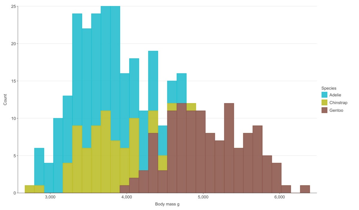 Sharon Machlis
 Histogram created with ggblanket.
The result is still a ggplot object, which means you can continue customizing it by adding layers with conventional ggplot2 code.
ggblanket is by David Hodge and is available on CRAN.
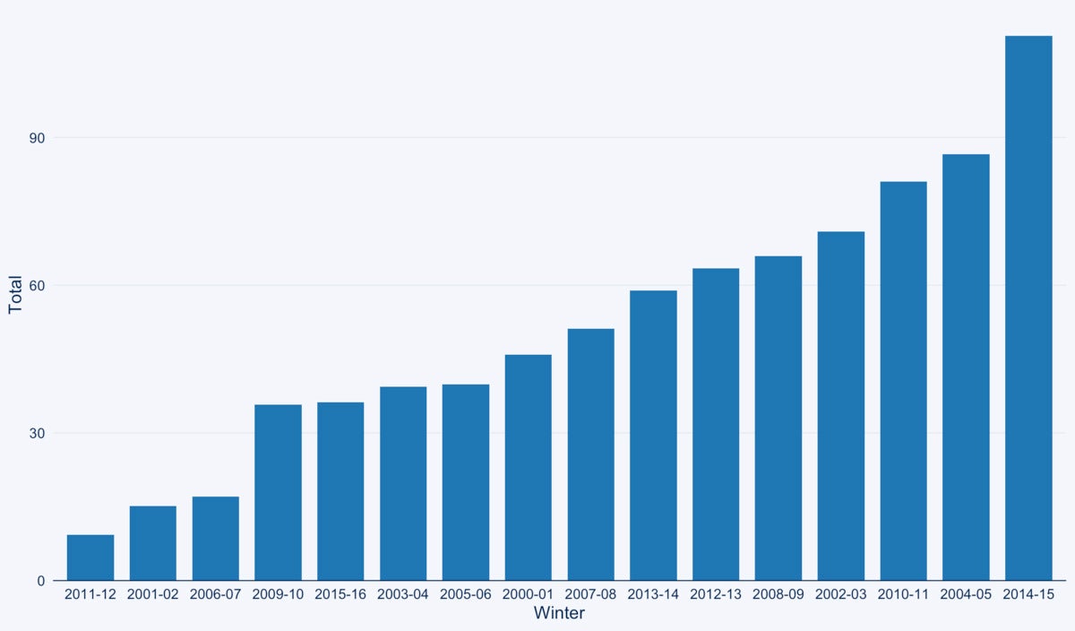
Several other packages try to simplify ggplot2 and change its defaults, too, including ggcharts. Its simplified functions use syntax like
library(ggcharts)
column_chart(snowfall2000s, x = Winter, y = Total)
That single line of code provides a pretty decent default, plus automatically sorted bars (you can easily override that).
 Sharon Machlis
 Bar chart created with ggcharts automatically sorts the bars by values.
See the InfoWorld ggcharts tutorial or the video below for more details.
Simple text customization: ggeasy
ggeasy doesn't affect the "main" part of your dataviz—that is, the bar/point/line sizes, colors, orders, and so on. Instead, it's all about customizing the text around the plots, such as labels and axis formatting. All ggeasy functions start with easy_ so it's, yes, easy to find them using RStudio auto-complete.
Need to center a plot title? easy_center_title(). Want to rotate x-axis labels 90 degrees? easy_rotate_labels(which = "x").
Learn more about the package in the InfoWorld ggeasy tutorial or the video below.
ggeasy is by Jonathan Carroll and others and is available on CRAN.
Highlight items in your plots: gghighlight
Sometimes you want to call attention to specific data points in a graph. You can certainly do that with ggplot alone, but gghighlight aims to make it easier. Just add the gghighlight() function along with a condition. For example, if winters with total snowfall higher than 85 inches are important to the story I'm telling, I could use gghighlight(Total > 85):
library(gghighlight)
ggplot(snowfall2000s, aes(x = Winter, y = Total)) +
  my_geom_col() +
  gghighlight(Total > 85)
 Sharon Machlis
 Graph with totals over 85 highlighted using gghighliight.
Or if I want to call out specific years, such as 2011-12 and 2014-15, I can set those as my gghighlight() condition:
ggplot(snowfall2000s, aes(x = Winter, y = Total)) +
  my_geom_col() +
  gghighlight(Winter %in% c('2011-12', '2014-15'))
gghighlight is by Hiroaki Yutani and is available on CRAN.
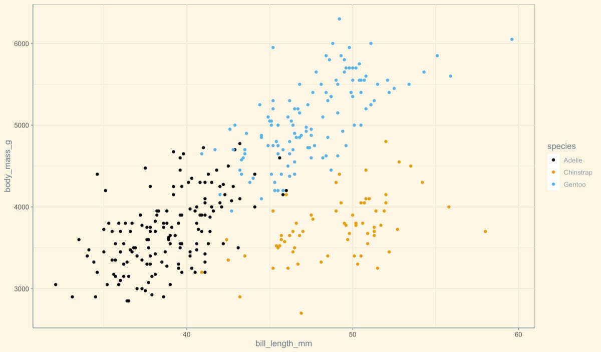
Add themes or color palettes: ggthemes and others
The ggplot2 ecosystem includes a number of packages to add themes and color palettes. You likely won't need them all, but you may want to browse through them to find ones that have themes or palettes you find compelling.
After installing one of these packages, you can usually use a new theme or color palette in the same way that you'd use a built-in ggplot2 theme or palette. Here's an example with the ggthemes package's solarized theme and colorblind palette:
library(ggthemes)
ggplot(penguins, aes(x = bill_length_mm, y = body_mass_g, color = species)) +
  geom_point() +
  ggthemes::theme_solarized() +
  scale_color_colorblind()
 Sharon Machlis
 Scatter plot using a colorblind palette and solarized theme from the ggthemes package.
ggthemes is by Jeffrey B. Arnold and others and is available on CRAN.
Other theme and palette packages to consider:
ggsci is a collection of ggplot2 color palettes "inspired by scientific journals, data visualization libraries, science fiction movies, and TV shows" such as scale_fill_lancet() and scale_color_startrek().
hrbrthemes is a popular theme package with a focus on typography.
ggthemr is a bit less well known than those others, but it has a lot of themes to choose from plus a GitHub repo that makes it easy to browse themes and see what they look like.
bbplot has just a single theme, bbc_style(), the publication-ready style of the BBC, as well as a second function to save a plot for publication, finalise_plot().
paletteer is a meta package, combining palettes from dozens of separate R palette packages into one with a single consistent interface. And that interface includes functions specifically for ggplot use, with a syntax such as scale_color_paletteer_d("nord::aurora"). Here nord is the original palette package name, aurora is the specific palette name, and the _d signifies that this palette is for discreet values (not continuous). paletteer can be a little overwhelming at first, but you will almost certainly find a palette that appeals to you.
Note that you can use any R color palette with ggplot, even if it doesn't have ggplot-specific color scale functions, with ggplot's manual scale functions and the color palette values, such as scale_color_manual(values=c("#486030", "#c03018", "#f0a800")).
Add color and other styling to ggplot2 text: ggtext
The ggtext package uses markdown-like syntax to add styles and colors to text within a plot. For example, underscores surrounding the text add italics and two asterisks around the text create bold styling. For this to work properly with ggtext, the package's element_markdown() function must be added to a ggplot theme, too. Syntax is to add the appropriate markdown styling to the text and then add element_markdown() to the element of the theme, such as this for italicizing a subtitle:
library(ggtext)
ggplot(snowfall2000s, aes(x = Winter, y = Total)) +
  my_geom_col() +
  labs(title = "Annual Boston Snowfall", subtitle = "_2000 to 2016_") +
  theme(
    plot.subtitle = element_markdown()
  )
ggtext is by Claus O. Wilke and is available on CRAN.
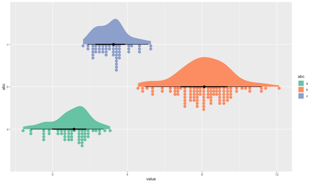
Convey uncertainty: ggdist
ggdist adds geoms for visualizing data distribution and uncertainty, generating graphics like rain cloud plots and logit dotplots with new geoms like stat_slab() and stat_dotsinterval(). Here's one example from the ggdist website:
library(ggdist)
set.seed(12345) # for reproducibility
data.frame(
  abc = c("a", "b", "b", "c"),
  value = rnorm(200, c(1, 8, 8, 3), c(1, 1.5, 1.5, 1))
) %>%
  ggplot(aes(y = abc, x = value, fill = abc)) +
  stat_slab(aes(thickness = stat(pdf*n)), scale = 0.7) +
  stat_dotsinterval(side = "bottom", scale = 0.7, slab_size = NA) +
  scale_fill_brewer(palette = "Set2")
 Sharon Machlis
 Rain cloud plot generated with the ggdist package.
Check out the ggdist website for full details and more examples. ggidst is by Matthew Kay and is available on CRAN.
Add interactivity to ggplot2: plotly and ggiraph
If your plots are going on the web, you might want them to be interactive, offering features like turning series off and on and displaying underlying data when mousing over a point, line, or bar. Both plotly and ggiraph turn ggplots into interactive HTML widgets.
plotly, an R wrapper to the plotly.js JavaScript library, is extremely simple to use. All you do is place your final ggplot within the package's ggplotly() function, and the function returns an interactive version of your plot. For example:
library(plotly)
ggplotly(
ggplot(snowfall2000s, aes(x = Winter, y = Total)) +
  geom_col() +
  labs(title = "Annual Boston Snowfall", subtitle = "2000 to 2016")
)
plotly works with other extensions, including ggpackets and gghighlights. plotly graphs don't always include everything that appears in a static version (as of this writing it didn't recognize ggplot2 subtitles, for example). But the package is hard to beat for quick interactivity.
Note that the plotly library also has a non-ggplot-related function, plot_ly(), which uses a syntax similar to ggplot's qplot():
plot_ly(snowfall2000s, x = ~Winter, y = ~Total, type = "bar")
ggiraph feels "truer" to the original static graph to me for some complex ggplot graphics. And, ggplot2 subtitles work. Turning a static ggplot into an interactive HTML process requires three steps:
- Use a ggiraph interactive geom, such as
geom_col_interactive()instead ofgeom_col(); - Add at least one interactive argument to your plot's
aes(). Available arguments includetooltipanddata_id; and - Use the
girafe()function to make the plot interactive. Since you're restricted to available ggiraph geoms, custom geoms won't work here. gghighlight does, though.
For example:
library(ggiraph)
mygraph <- ggplot(snowfall2000s, aes(x = Winter, y = Total, tooltip = Total)) +
  geom_col_interactive(color = "black", fill="#0072B2") +
  theme_minimal() +
  theme(panel.border = element_blank(), panel.grid.major = element_blank(),
        panel.grid.minor = element_blank(), axis.line =
          element_line(colour = "gray"),
        plot.title = element_text(hjust = 0.5),
        plot.subtitle = element_text(hjust = 0.5)
  ) +
  scale_y_continuous(label = comma) +
  ylab("") + xlab("") +
  labs(title = "Annual Boston Snowfall", subtitle = "2000 to 2016")
girafe(ggobj = mygraph)
There is a lot more you can do with ggiraph, including linking the interactivity of multiple graphs so that mousing over one graph highlights the same data in another. Check out my tutorial video below or this InfoWorld article.
The plotly package is by Carson Sievert and ggiraph is by David Gohel. Both are available on CRAN.
Explain the stats behind your plot: ggstatsplot
ggstatsplot adds written statistical details to visual data analyses, such as looking at correlations, histograms, and violin plots. For example, this code creates a matrix of correlation coefficients looking at relationships in the msleep data set (msleep comes with the ggplot2 package):
library(ggstatsplot)
ggcorrmat(
  data     = ggplot2::msleep,
 colors   = c("#B2182B", "white", "#4D4D4D"),
  title    = "Correlalogram for the msleep mammals sleep data set in ggplot2",
  subtitle = "Sleep units: hours; weight units: kilograms"
)
 Sharon Machlis
 Correlation visualization created with ggstats.
Text at the bottom right explains that an X through a box indicates non-significant relationship at a p value less than 0.05.
ggstatsplot is by Indrajeet Patil and is available on CRAN.
Drag-and-drop ggplot: esquisse
If you like a graphical user interface when creating data visualizations, check out esquisse. You can access the package's GUI by running its RStudio add-in or the esquisser() function from an R console prompt. The resulting interface lets you upload files or use existing objects in your R environment. Then, click to choose graph type, x axis, y axis, fill, color, size, group, and facet, as well as to customize text, number of records, legend position, and more.
 Sharon Machlis/IDG
 Creating an ordered bar graph with the esquisse package.
Once you've finalized your graph, you can export it as an image. You also have access to the underlying R code that generated the plot cand can send it back to the R console for re-use or additional tweaking. For example, I didn't see an option to sort bars by ascending or descending value order, so that's a task you'd want to do inside R.
See more in the InfoWorld esquisse tutorial or in the video below.
esquisse is by Fanny Meyer, Victor Perrier, and others and is available on CRAN.
Multiple plots: patchwork
If you want to display multiple plots in a single area, patchwork is one of the simplest options. If you've saved two plots, one as p1 and the other as p2, p1 + p2 displays them side by side while p1 | p2 places p2 below p1.
patchwork can handle more complex layouts as well. Say you want p1 alone in the first row with p2 and p3 next to each other below: p1 | (p2 + p3). Plots with titles will display those titles in a patchwork grid, but you can also add an overall title and subtitle such as this sightly modified example from the patchwork website:
library(patchwork)
p1 <- ggplot(mtcars) +
  geom_boxplot(aes(gear, disp, group = gear)) +
  ggtitle('Box Plot')
p2 <- ggplot(mtcars) +
  geom_point(aes(mpg, disp)) +
  ggtitle('1st Scatter Plot')
p3 <- ggplot(mtcars) +
  geom_point(aes(hp, wt, colour = mpg)) +
  ggtitle('2nd Scatter Plot')
p1 / (p2 + p3) +
  plot_annotation(title = 'My overall dataviz title',
                  subtitle = 'From the patchwork package',
                  caption = 'Source: mtcars data set'
                  )
 Sharon Machlis
 Plots arranged in a grid with the patchwork R package.
It's also possible to add text or tables in the grid, not only plots, although at that point I'd probably be using an R Markdown or Quarto document.
patchwork is by Thomas Lin Pedersen and is available on CRAN.
Another good option is cowplot, which was originally developed as a package to add more themes to ggplot. However, cowplot also includes a plot_grid() function that positions multiple plots in an area and adds labels, for example plot_grid(p1, p2, labels = c('First Plot', 'Second Plot'), label_size = 12).
Yet more useful ggplot extensions
There are so many useful ggplot2 extensions that it was hard to highlight only 12! Here are a few more that are worth a look:
gganimate is one of the most popular extensions available, "extend[ing] the grammar of graphics as implemented by ggplot2 to include the description of animation," according to the gganimate website. It provides new classes that describe how a dataviz should change over time.
ggrepel features geoms that ensure text labels don't overlap each other, appear too close to data points, or bump up to the plot edge.
camcorder tracks and records all ggplots created in an R session so you can eventually create a gif. This package is not on CRAN and must be installed with remotes::install_github("thebioengineer/camcorder", build_vignettes = TRUE).
geomtextpath lets you easily generate curved text labels, such as this example from the package website:
library(geomtextpath)
ggplot(iris, aes(x = Sepal.Length, colour = Species, label = Species)) +
   theme(legend.position = "none") +
   geom_textdensity(size = 6, fontface = 2, spacing = 50, vjust = -0.2, hjust = "ymax") +
   ylim(c(0, 1.3))
 Sharon Machlis
 Curved labels on a line graph made with the geomtextpath R package.
ggforce has various geoms that offer additional ggplot2 functionality. One I found particularly interesting is facet_zoom(), which creates a second zoomed-in plot from an initial visualization:
library(ggforce)
ggplot(iris, aes(Petal.Length, Petal.Width, colour = Species)) +
geom_point() +
facet_zoom(x = Species == "setosa") +
ggsci::scale_color_startrek() # trying ggsci's startrek palette too
 Sharon Machlis
 Plot with a zoomed facet from the ggforce R package (this plot also uses the startrek palette from the ggsci package).
see is part of the easystats family of R packages aimed at the entire workflow of statistical analysis. The see package generates visualizations "for a wide variety of models and statistical analyses in a way that is tightly linked with the model fitting process and requires minimal interruption of users' workflow," according to the package site. see uses a single function, plot(), that works with objects generated by other easystats packages. Resulting plots are ggplot2 objects and can be further customized with ggplot2 functions.
For still more R extensions, check out the ggplot2 extensions gallery. And for more R tips, see InfoWorld's Do More With R tutorials page.

Comments
Post a Comment